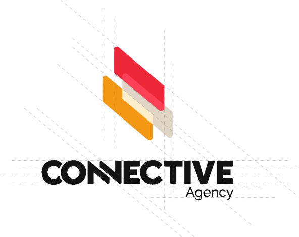
Our Primary Logo

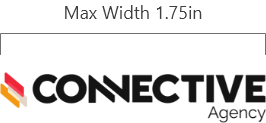
Always be aware of size and legibility. To ensure quality reproduction in print and on screen, the primary logo must appear no smaller than 1.75” in width.
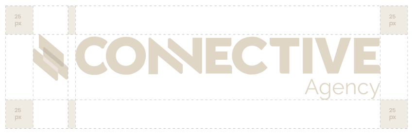
An Infringement Zone has been designed to create a clear space around the logo to ensure it remains uncrowded. To ensure clarity, it is important that other elements do not enter this zone. Always leave a clear space of 25 pixels around all sides of the logo as shown below.
When there is insufficient space for the primary logo, then the stacked logo may be used. Use the provided artwork to ensure the sizing of the icon to the wordmark is consistent.
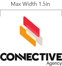
The stacked logo must appear no smaller than 1.5” in width to ensure quality reproduction in print and on screen.
The icon is comprised of three different shapes that come together to represent energy, connectivity and movement. The mix between round and rigid edges offers a nice balance between hard and soft logos.

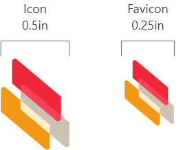
This icon must appear no smaller than 0.5’’ in width to ensure quality reproduction in print and on screen. The favicon may only be used on the website.
The single color logo may be used on a dark or white background, or when you are only allowed one color to print. An example may be embroidering or foiling the logo. Only use the colors noted when dealing with the single color logo.
Always consult a designer when using the one color solid icon logo specifically. The icon may need to be adjusted depending on the size of the logo. This will ensure there is enough negative space in the icon.